This page features interactive visualizations, charts, and maps designed to illustrate the data that the Demographic Research Unit tabulates and produces. To access a visualization, click on the graphic images below.
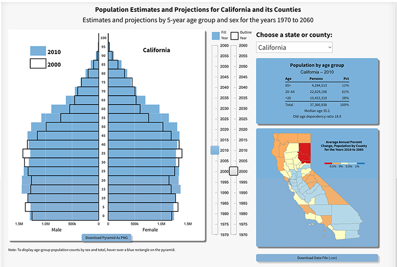
Population Pyramid – 1970 to 2060
The population pyramid dashboard is interactive and illustrates the evolving age structure for California from 1970 to 2060. It highlights data from the 2019 vintage population projections (years 2020 to 2060) released on April 23, 2021.
- The 1970 to 2019 population estimates and 2020 to 2060 population projections data are available for download as a csv file.
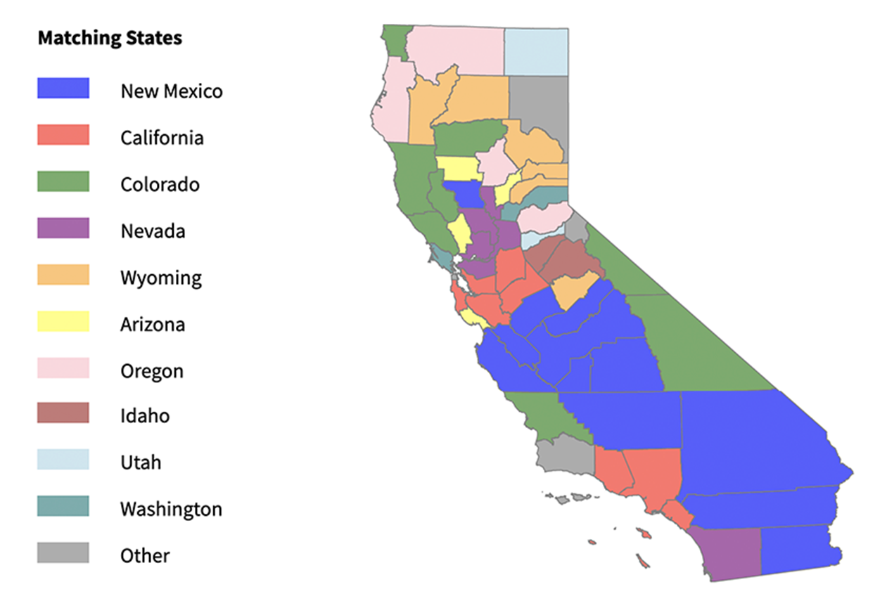
California’s Counties and the States
The visualization compares the race and ethnic distributions of each of California’s 58 counties with those of the 50 states and the District of Columbia to gauge the racial/ethnic diversity found throughout California.
- The data powering this visualization are available for downloading as a csv file.
Note: To view the visualizations, you will need a current browser set to execute JavaScript.


